Wednesday, 14 September 2016

Winsor & Newton Pigment Marker


I started out with a small range of Winsor & Newton pigment markers plus a white blender and a clear blender. There is a lovely transparency to these markers and they overlap well. The clear blender seems to dissipate the colour similar to copic blenders. The white blender turns the marker colour into a tint of the original however using it on top of damp pigment marker tends to agitate the surface of the paper. For this test I'm using Bristol Board. Check out Using Colour Theory for more info on shades, tints and tones and using primary colours to create other colours.


The doodle I chose to redo in pigment markers is of a large eye, bird and feathers. I felt the colours I had in the pigment markers could be mixed to create the purple and green and orange. I've been wanting to practise inking eyes as I feel my current style is simplistic.


Tried out a little pre-redo (is that a word?), a thumbnail, and am experiencing how these markers work. I recommend doing this before launching into the final piece - something I often am too impatient to do! Perhaps I should start a sketchbook just for trying out different mediums as it would be a good record I could refer back to. Some of the markers seem darker at one end than the other which might be down to my storing them vertically rather than horizontally. 

Invested in an A3 Bristol Board sketchpad - Bradbury Art had a sale! I intended doing a version of the doodle in the centre of the sheet leaving quite a lot of white around - there was something about the thumbnail against white. But before I realised it I was working on the entire sheet so the finished image is now A3.

Did a little bit of researching how an eye looks up close and it's okay, have added a few extra effects to it. Changed the bird quite a bit, again after doing some visual research. The feathers have become smaller and more realistic and the sun is softer, more impressionistic - almost like a flower. 


The range of tints and tones by overlapping these markers was good and the results didn't get muddy. The darkest colour in the eye is from overlapping the blue and adding red and then blue again on top which gave a dark purple-blue, redder than indigo, meaning I didn't have to use black at all. I did use some white gel pen to touch up the small white areas in the eyes and also to outline the bird and add highlights to the feathers.

The surface of the page was roughened in a few spots but I think this is due to impatience on my part, not waiting until the colours dry before reapplying. I'll certainly use this type of marker again because of the vibrancy of the colour and the clarity of colour even after layering.


Copyright © 2016 by Roisin O'Hagan/bloowabbit
All rights reserved. The artworks/illustrations or any portion thereof may not be reproduced or used in any manner whatsoever without the express written permission of the artist except for specific permission granted with a free downloadable.


Monday, 12 September 2016

KADENZE comics course 'Defining Comics'


I signed up for a course with Kadenze thinking it might spur me onto completing a comic strip I'd started 5 or 6 years ago. Unlike some courses all the videos are not presented at once. Instead 3 videos are released each Tuesday and assignments set each week based upon what was covered. As I'm doing the course free my assignments won't be discussed or graded. Covering the coursework done in my blog gives me a opportunity to self-critique and I welcome comments from readers.

The first few videos covered what the definitions of a comic were, and there were a few. Following this was the various relationships between art and text. Lots of food for thought.


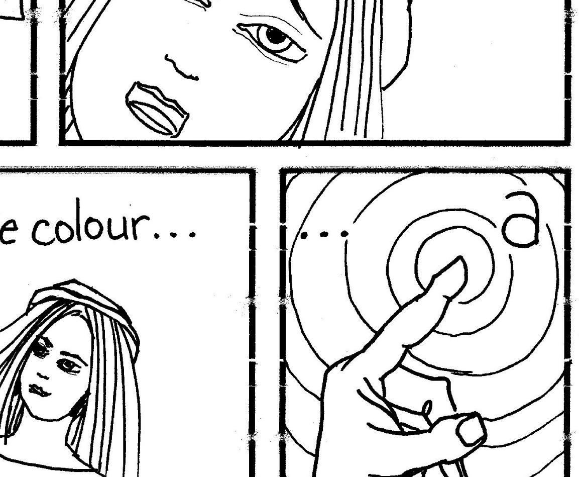
1st assignment is to create a 2 page comic based on some aspect of ourself. Comic templates were provided. I drew thumbnails in pencil on the back of spare paper and then began to fill in the template boxes, first in pencil and then in ink.

I had wondered if I was one of the oldest students on the course so I based my comic on the issue of age. Recently I'd read the poem 'When I am an old woman I shall wear purple' written by Jenny Joseph in 1932 at the ripe young age of 29. I included myself holding/wearing a hat as in the poem is the line 'with a red hat which doesn't go' and I could visualise the colours in the comic as being mainly purple and indigo with touches of red.

I like breaking through the confines of boundaries so the first panel leads directly into the second. I'm not sure about the top two panels on the second page - I feel they could be more visually interesting. When I looked at the assignment script after I'd finished I saw that I was supposed to include two panels side by side without text. If I learn something from this task it's to read the instructions before I begin.


The second assignment was to look for comics in everyday life while understanding that a series of image and text might be described as a comic. The pictorial instructions on a Fiskars weed puller seemed to fall into that as did the step-by-step method of applying a tubular bandage from a first aid book. 

I suppose by recognising extremes of an artform we don't confine our imaginations by pre-set boundaries.

As in most online courses we're encouraged to join a forum on the site and discuss each week's topic. The final assignment is to look at each other's comics and photos of extreme comics and leave a comment. At this point I really wish I could read what the other students and the tutor thought of my work. 


Copyright © 2016 by Roisin O'Hagan/bloowabbit
All rights reserved. The artworks/illustrations or any portion thereof may not be reproduced or used in any manner whatsoever without the express written permission of the artist except for specific permission granted with a free downloadable.
Thursday, 8 September 2016

Wedding Wish


I've had a rough week with flaring Polymyalgia and ME so Wednesday's blogpost didn't get written. But I did do a congratulations card for a couple nice folk I know online.


Alex and Kayla Benda run an online sticker emporium, Oh Hello Stationery Co, designing all their own stickers mainly for use on planners. They got married at the weekend and I created this set of designs to tie in with the wedding colours. I'd wanted to send them a little hand-done card so I got drawing. 


First I began to doodle in pencil weaving the floral shapes from their sticker designs around a font that evolved on the page. A vine made a good ampersand and two rings intertwine like a little butterfly. 


As usual I inked it up with uniPIN fine liner. I hadn't been able to find my glasses that day so some of the inking wasn't as perfect as I'd intended. It happens. As the card was entirely done by hand and not being photoshopped I used a white gel marker to touch up the errors and began to ink.

Used a mix of markers: Copic, ProMarker, Letraset flex, Chafford, W&N Pigment Markers and Letraset Aqua Markers. Whichever pens matched best the colours used in Alex & Kayla's stickers were used. The mixed medias worked quite well together on Bristol Board although the coverage of the large blue flower at the top left corner (Chafford marker - cheapy cheapy) could have been better.

I chose brown to ink the font and went over the edges again with black fineliner to prevent them getting lost in the foliage.


Congrats Alex & Kayla
WIshing you Health, Wealth and Happiness
xx


Copyright © 2016 by Roisin O'Hagan/bloowabbit
All rights reserved. The artworks/illustrations or any portion thereof may not be reproduced or used in any manner whatsoever without the express written permission of the artist except for specific permission granted with a free downloadable.


Monday, 5 September 2016

First art journal 1978-81


I didn't realise it at the time but I kept an art journal while I was at art college. A blank paged A5 book with decent quality paper. I collected photos, little drawings, poems and prose. 

I included a number of poems I wrote myself which I'm not sharing! Very occasionally I write a decent poem, which I will share, but the bulk of my 'poems' are long-winded and not very good. I'm not a poet.


Photographs are from family albums, places I've holidayed at and trips from college. Writings are from Kahil Gibran, Diane Arbus, Bernard Leach and Lewis Carroll amongst others. Drawings are not directly linked to art I was making at the time but thoughts or emotions I was thinking or feeling at the time.


Although the pages of the book aren't treated or decorated beforehand or during the recordings it still stands as an art journal. A very simple system of recording.


I know what I like when I see other people's art journaling yet I'm still not clear about how I want to draw/write my own style. With each time I try another person's process of journaling I get a little closer to what feels right for me.

Every time I take out this book and look at it, read what's written in it, I travel back in time to the days I spent at art college. I think that's the powerful thing about journaling, being able to time travel in our minds. 


Links:

Art journaling - Arne & Carlos


Copyright © 2016 by Roisin O'Hagan/bloowabbit
All rights reserved. The artworks/illustrations or any portion thereof may not be reproduced or used in any manner whatsoever without the express written permission of the artist except for specific permission granted with a free downloadable.


Thursday, 1 September 2016

Art journaling - Arne & Carlos


In issue 14 of Flow magazine I found a small workbook entitled 'Tiny Pleasures Art Journal' based on the art journaling style of Scandinavian designers Arne Nerjordet and Carlos Zachrison. They have written many books on knitting but are also fans of art journaling. The Tiny Book is a collaboration between Flow's Irene and Astrid and the two designers.


images of Flow magazine

Flow is a Dutch magazine 'Celebrating Creativity, Imperfection and Life's Little Pleasures'. It's filled with decent articles and great photography. There's always something included such as workbooks or diaries or in this case an introduction to art journaling. (there's usually stickers or decals and beautiful paper too). It's not cheap but is published every quarter. And the pages from old copies get used in my creative pursuits.

The art journaling article is written about Dawn deVries Sokol, a designer with an art journaling style all of her own - black ink and washes of colour. Other journalers mentioned are Arne & Carlos, Leonardo daVinci, Peter Beard and Elma deJong

images from Flow magazine and the Tiny PAJ

The magazine and the workbook give lots of tips how to art journal and include images of various styles. I like to see visual records of how something's done even if my adaptation turns out differently.


Among the tips given is to sort out papers you might want to use. I opted for using up pages from old Daphnes Diary magazines and free papers from craft magazines I bought last year. I added some die cuts and heavy card stickers as embellishments. I intend using a range of art pens and markers to draw and write with.


I don't intend completing a page a day - as there's 21 blank pages in the workbook that's enough to see me through September. The pages vary in colour and are decorated by little icons. I may take inspiration from them or do something completely different. 


Copyright © 2016 by Roisin O'Hagan/bloowabbit
All rights reserved. The artworks/illustrations or any portion thereof may not be reproduced or used in any manner whatsoever without the express written permission of the artist except for specific permission granted with a free downloadable.