Wednesday, 28 September 2016

Fan art - Merida


I'd been seeing a lot of online artists creating their version of fan art whether from Pokemon, Disney or other game/movie/book. I'm not sure why I didn't choose Chewbacca or Batman to draw as they're a couple of my favourite characters. But I looked at the Disney females and thought of Merida. She's feisty and natural (until later versions which have 'beautified' her). For this fan art I envisaged her as more of a Dungeons and Dragons warrior.


Sycra's Anatomy model came in handy when drawing the character. Check out earlier blog post on drawing anatomy HERE. 


Had a look at my marker stock in the colours I would need and realised that this piece might be more multi-medium as the colour ranges in each type of marker need to be replenished. 


I'm happy enough with this first attempt at fan art. There are a few parts of the piece I'd like to change - her left arm is a little butch and I think the angle of the bowstring isn't accurate. I might try another character - Mulan - now she also was a strong female!


Copyright © 2016 by Roisin O'Hagan/bloowabbit
All rights reserved. The artworks/illustrations or any portion thereof may not be reproduced or used in any manner whatsoever without the express written permission of the artist except for specific permission granted with a free downloadable.

Monday, 26 September 2016

KADENZE comics course 'Time and Space'


This week's course videos were interesting - the tutor spoke about how an artist can convey time and space within panels, outside panels and between panels. We also got to watch an interview with a comic artist, Chuck BB, while he worked, as he described on what and how he was working. This was more than learning theory on a course.

I'd once watched a conversation almost develop into a verbal fight between a writer and a comic artist as to which had the more impactive role. I sat at the workshop table, my glance moving from one to the other like the ball in Pong. I was guilty of asking the question, 'Does a comic artist think they're more important to the comic than the writer and vice versa?'. 

In the interview Chuck BB was asked if he prefered the writer sending him the storyline in full scripts or in Marvel style (paragraph or two about what's happening on each page). And he said somewhere in between was good. While the latter gives him more freedom to decide what visually goes into the comic, having a script writer can be okay as long as there's the opportunity to negotiate possible changes. I got the sense this comic artist was flexible and very sure of his worth which in turn made me think about the conversation that had got out of hand.


This week's assignment was to make three single page six-panel comics. The first had to portray the message happening within a second. The second page within an hour and the third page within a day. This was about exploring Compression and Decompression.


I had left the assignments until Sunday so the drawings are a bit rushed. I found 'A Second' page easiest as it was something that had actually happened. Sitting in a Chinese takeaway I heard a sharp sound. Turned out some lads driving past with a Bebe gun had shot at the window beside me leaving a tiny hole in the glass. The other two pages are more contrived, 'An Hour' is based on the saying 'a watched kettle never boils' and 'A Day' is based on how travelling is what fatigues me the most. The day begins and ends with me in my comfortable bed. I was happy with the alarm clock effect and using some colour in the panels helped diminish the busyness of the street.


Copyright © 2016 by Roisin O'Hagan/bloowabbit
All rights reserved. The artworks/illustrations or any portion thereof may not be reproduced or used in any manner whatsoever without the express written permission of the artist except for specific permission granted with a free downloadable.

Thursday, 22 September 2016

First YT video...


My son Harry had recently bought me an iphone and since then has presented me with a gorilla tripod complete with iphone attachment (and a wide angle clip-on lens but that'll be a different blog). He knew how much I'd wanted to make some videos and thought he'd do something about that.

So today I wrestled with Windows Movie Maker - it's very straightforward once you get the hang of it and watch a few tutorials and listen to loads of tips from encouraging pals. Harry had even sourced Lightworks in case I decided I didn't like MM. How could I fail in the face of all that support? 

The problem was I'd taken the video with the iphone on the gorilla strapped to my regular tripod during daylight (lighting's on the Christmas list) but hadn't realised that it would record the Netflix series Continuum, the dog barking and my less than ex-convent-schoolgirl remarks. I eventually worked out I could simply mute the video on MM and then when uploading onto YT add a free music track. Simples! 

So...enjoy. If I would change anything it would be the tiny speck on the iphone lens - once you see it you can't stop watching it - and how dry my hands look. There'll be a slathering of Body Shop shea butter on my paws before bed tonight and every night thereafter. 


Copyright © 2016 by Roisin O'Hagan/bloowabbit
All rights reserved. The artworks/illustrations or any portion thereof may not be reproduced or used in any manner whatsoever without the express written permission of the artist except for specific permission granted with a free downloadable.

Wednesday, 21 September 2016

Drawing without looking


Just for fun...I thought I'd try to copy a doodle without looking at what I was doing. I decided against blindfolding myself as I needed to look at the original while drawing. Instead I positioned a barrier over the page on which I was working leaving myself room to draw. 


First I used a black fineliner to sketch the outline. I did take a peek at this stage in order to photograph it and it looked better than I had thought it would. 

Then I added colour with Letraset flex markers, following the colours as in the doodle. I thought I was copying the ink drawing quite closely but when I looked at it the colour was all over the place. I did like the pattern of the stars on the left and was impressed that the right eye was so accurate. 


To finish I added coloured pencil. Normally I'd follow the marker base quite closely but at this stage I knew it would be hit or miss. I finished with some white gel pen to outline the stars and the left hand side edge of hair.

Drawing upside-down - June '16


Copyright © 2016 by Roisin O'Hagan/bloowabbit
All rights reserved. The artworks/illustrations or any portion thereof may not be reproduced or used in any manner whatsoever without the express written permission of the artist except for specific permission granted with a free downloadable.

Monday, 19 September 2016

KADENZE comics course 'Comics Relationships'


This week's series of videos, ten in all, broke down the definitions of each relationship of image... 

  • Moment to Moment
  • Action to Action
  • Subject to Subject
  • Scene to Scene
  • Aspect to Aspect
  • Non Sequitur
  • Symbolic
and text...
  • Word Specific
  • Picture Specific
  • Duo Specific
  • Intersecting
  • Interdependent
  • Parallel
  • Pictorial


This assignment was to make a comic diary over five days using the downloadable resource of an A4 sheet with a single rectangle. We could choose to do a single panel or break the rectangle into separate panels. Needless to say when I'm given a box I like to break out of it. On each day we had to include one of the relationships as described in the videos and the content of our diaries had to reflect some aspect of our days that week.


My disability has featured heavily in my diary because of the knock-on effects from it having flared over the past couple of weeks. If it hadn't my comic diary might well have been about my overgrown garden or my dog or playing Pokemon Go (love it). 


My favourite has to be Non Sequitur in which there is an unclear relationship, a randomness of image. This reminds me of the comic book 'Trip to Tulum' by Milo Manara, inspired by the shamanic journeys of Carlos Casteneda and involving Frederico Fellini in the final stages. It's dreamlike in a bizarre way. The reader sometimes has to make their own connections from panel to panel. 

For me, the mannequin holding the sockwabbit and the dog timer are two of the things I see on my desk every day. For me it describes both my art full of escapism and creative satisfaction, and my everyday life where the timer reminds me to check on the dinner I've cooking in the oven. However I selected them each randomly. By attaching meaning to the images I change them from Non Sequitur to Symbolic.


Copyright © 2016 by Roisin O'Hagan/bloowabbit
All rights reserved. The artworks/illustrations or any portion thereof may not be reproduced or used in any manner whatsoever without the express written permission of the artist except for specific permission granted with a free downloadable.

Friday, 16 September 2016

Making jewellery


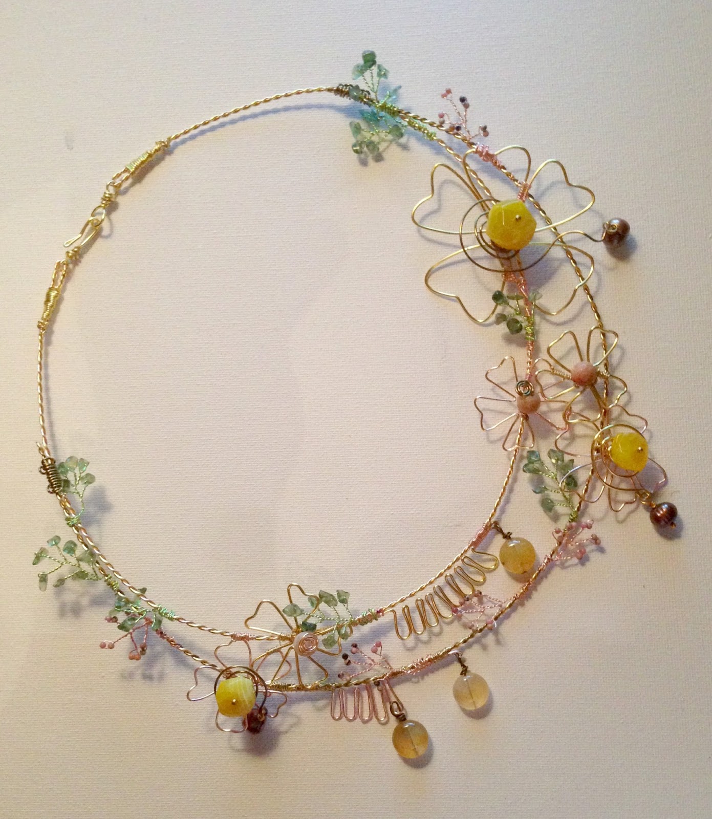
As a sideline I've been making costume jewellery since art college. Sometimes it's bead with cord and sometimes it's wire with glass or semi-precious stones. I've even done a short course in silversmithing. Then there was the time I ran a 'Junk to Jewellery' night class in the early days of the Crescent Arts Centre (before upcycling was popular). I've always loved jewellery, feel naked if I go out without earrings and like a magpie am attracted to shiny sparkly things.


I'd been building up my jewellery making stash when I started a workbook, filled with cutout images from jewellery magazines I needed to get rid of but couldn't bear to entirely scrap. Beside the images I doodled ideas to make. A simple code helped see at a glance what designs/designers I wanted to research and which ideas I didn't want to forget to try. 


It's a scrapbook of imagery and colour over which I doodled and wrote, much like an artist uses an art journal - same approach.


There were jewellery designers I loved. Jillian Lukiwski began an etsy shop selling her enamelled pieces and sold out as soon as she posted her designs. She's still making jewellery although it's evolved to reflect her lifestyle. Lilian Chen's work made wirework seem effortless as she encapsulates Swarovski crystals and semi precious gems. Links to both designers below.


Other images are included because I like their humour or because they're inspiring.


At the back of the workbook is a section on techniques, again salvaged from old jewellery publications. In the US wire is sized differently than in the UK - it's handy to have a ready reckoner.


And then it gets arty. A friend had sent me an image of Japanese cloth on fb which I copied, designed some wirework components and created a necklace from. 


Sometimes I saw a photograph of jewellery which I'd sketch in a pocket notebook and then make a copy when I got home. These earrings were made from silver plated and red enamelled wire with added vintage and modern glass beads. The originals were in blues and greens, based upon the sea.

Just like the old journal I found from art college days this workbook takes me back in time, about three years ago, when I was making jewellery. Ideas books are great things to pick up, reread and be re-inspired by.

Jillian's website
Jillian's Etsy shop
Lilian Chen on Pinterest
Lilian Chen feature 


Copyright © 2016 by Roisin O'Hagan/bloowabbit
All rights reserved. The artworks/illustrations or any portion thereof may not be reproduced or used in any manner whatsoever without the express written permission of the artist except for specific permission granted with a free downloadable.

Wednesday, 14 September 2016

Winsor & Newton Pigment Marker


I started out with a small range of Winsor & Newton pigment markers plus a white blender and a clear blender. There is a lovely transparency to these markers and they overlap well. The clear blender seems to dissipate the colour similar to copic blenders. The white blender turns the marker colour into a tint of the original however using it on top of damp pigment marker tends to agitate the surface of the paper. For this test I'm using Bristol Board. Check out Using Colour Theory for more info on shades, tints and tones and using primary colours to create other colours.


The doodle I chose to redo in pigment markers is of a large eye, bird and feathers. I felt the colours I had in the pigment markers could be mixed to create the purple and green and orange. I've been wanting to practise inking eyes as I feel my current style is simplistic.


Tried out a little pre-redo (is that a word?), a thumbnail, and am experiencing how these markers work. I recommend doing this before launching into the final piece - something I often am too impatient to do! Perhaps I should start a sketchbook just for trying out different mediums as it would be a good record I could refer back to. Some of the markers seem darker at one end than the other which might be down to my storing them vertically rather than horizontally. 

Invested in an A3 Bristol Board sketchpad - Bradbury Art had a sale! I intended doing a version of the doodle in the centre of the sheet leaving quite a lot of white around - there was something about the thumbnail against white. But before I realised it I was working on the entire sheet so the finished image is now A3.

Did a little bit of researching how an eye looks up close and it's okay, have added a few extra effects to it. Changed the bird quite a bit, again after doing some visual research. The feathers have become smaller and more realistic and the sun is softer, more impressionistic - almost like a flower. 


The range of tints and tones by overlapping these markers was good and the results didn't get muddy. The darkest colour in the eye is from overlapping the blue and adding red and then blue again on top which gave a dark purple-blue, redder than indigo, meaning I didn't have to use black at all. I did use some white gel pen to touch up the small white areas in the eyes and also to outline the bird and add highlights to the feathers.

The surface of the page was roughened in a few spots but I think this is due to impatience on my part, not waiting until the colours dry before reapplying. I'll certainly use this type of marker again because of the vibrancy of the colour and the clarity of colour even after layering.


Copyright © 2016 by Roisin O'Hagan/bloowabbit
All rights reserved. The artworks/illustrations or any portion thereof may not be reproduced or used in any manner whatsoever without the express written permission of the artist except for specific permission granted with a free downloadable.